The Tools of Knowledge Interface
SCIENTIFIC Instrument Makers
This visualisation, created for the Tools of Knowledge research project, is a bespoke interactive interface - designed to encourage the dynamic and richly contextualised exploration of an historical dataset - to support research, hypothesis formation, and knowledge creation.The source dataset for the project was Scientific Instrument Makers, Observations and Notes (SIMON) covering makers from the 16th to early 20th centuries. The interface addressed the challenge of visualising and revealing maker identities 'social networks' and trade descriptions over time.
.
ANIMATED Transitions
A key element of the interface is the ability to transition between and explore different views of the same data, as the user modifies or refines their selection. This allows the interface to integrate multiple views of the data into an single fluid environment.
The visualisation: enables dynamic exploration and fluid movement between different data states; allows exploration of the data from multiple perspectives; and helps to build knowledge of maker identity, community and chronology.

MAKER IDENTITY
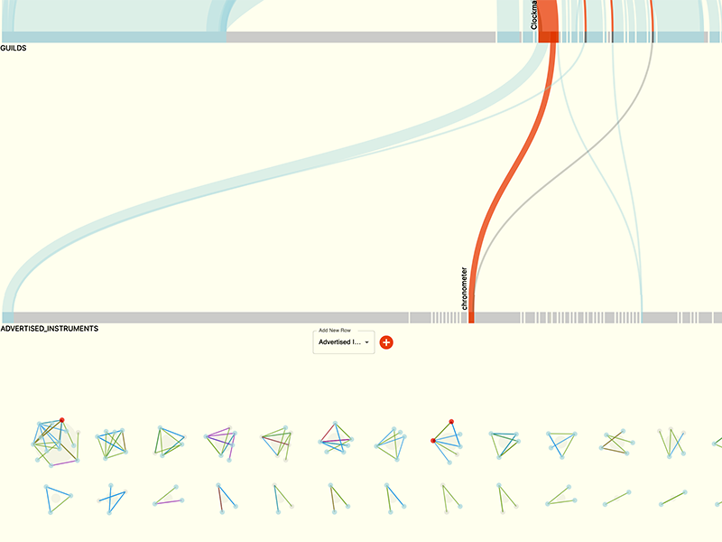
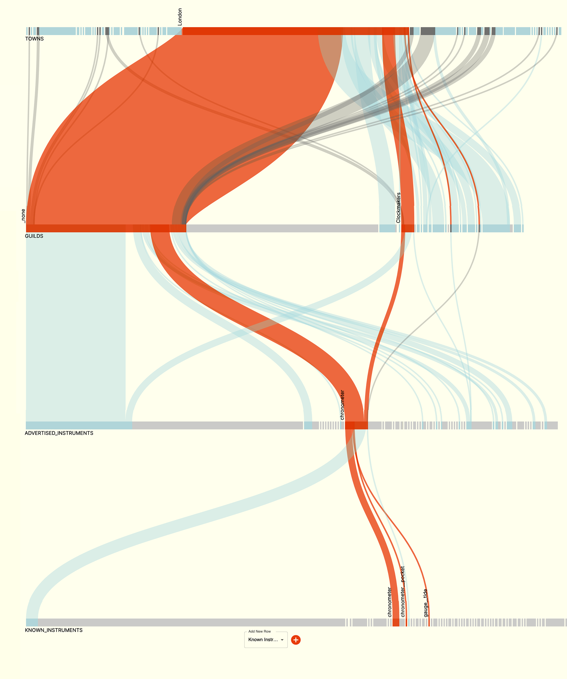
Maker 'identity' is revealed through the dynamic exploration and combination of individual attributes which combine to reveal specific maker types.
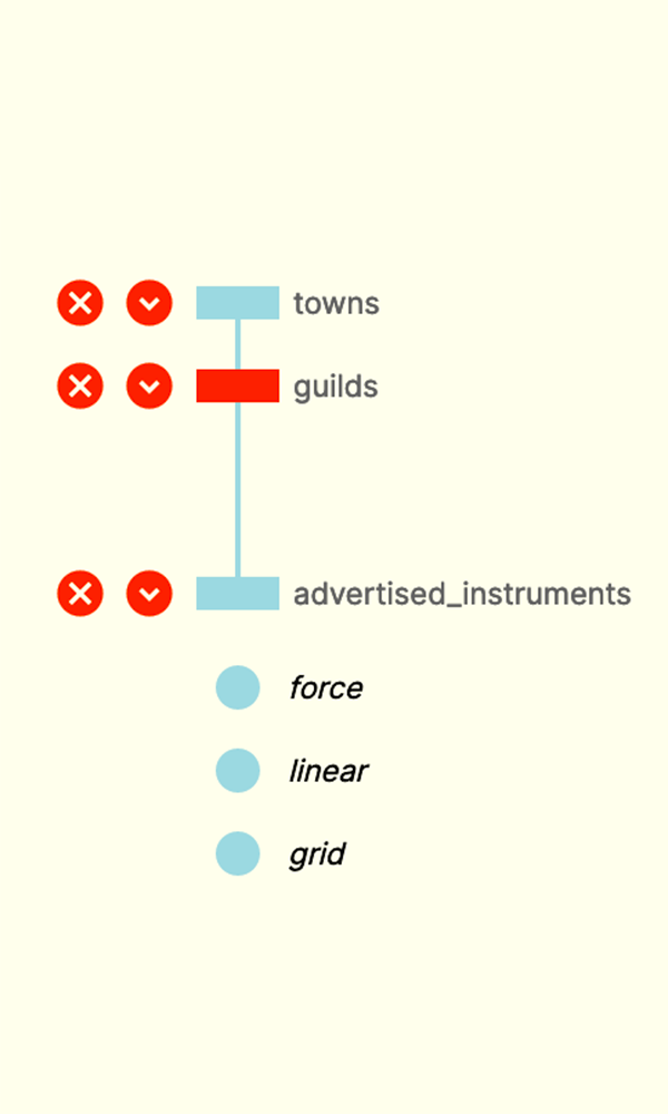
The interactive interface allows users to add combine and explore attributes, in order to generate identity 'flow lines' which filter and reveal groups of makers whose identity is created from a specific combination of attributes. These lines can be dynamically explored, modified (by addition or subtraction) and viewed through different historical date ranges.
The example here shows groups of makers, filtered through a combination of attributes: 'town', 'guild' 'advertised instrument' and 'known instrument'
Maker COMMUNITY
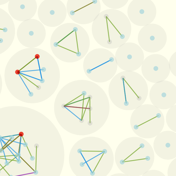
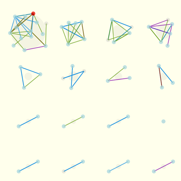
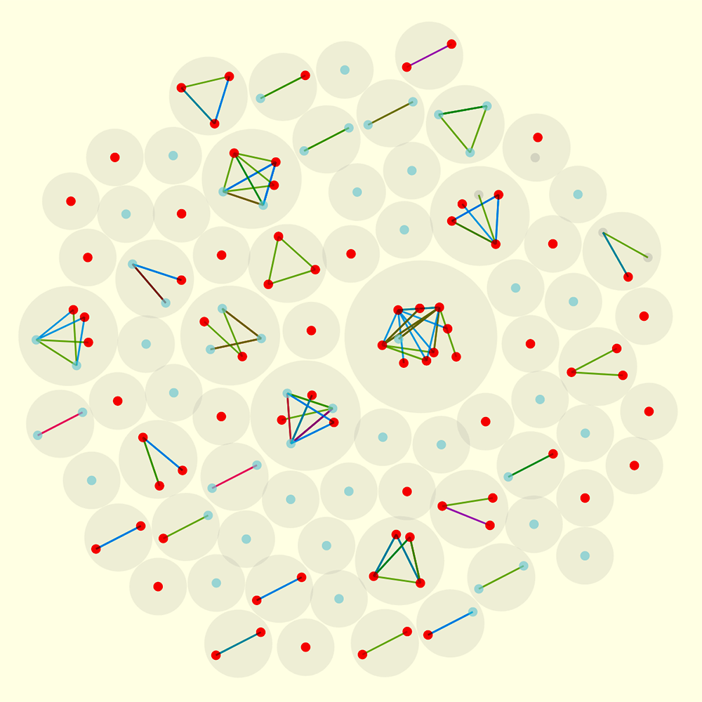
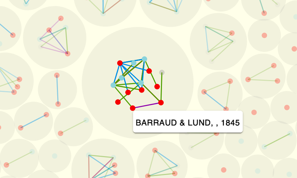
A social network view reveals how those makers, selected by the identity flow-lines, are connected within their wider community - either through family, business or commercial relationship. 'Block' groupings of maker identities are visualised into individually named makers, situated within their wider network. In the network view, found makers are highlighted within their clusters as red dots.
The types of relationship between makers is indicated by the colour of the links which connect them. Selecting one of the nodes reveals name and dates of the a selected maker. A detailed list of found makers is shown in a table at the foot of the page.

MAKER CHRONOLOGY
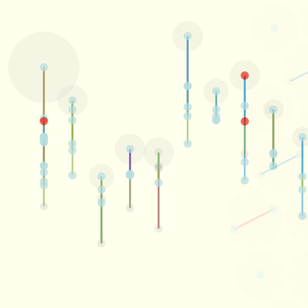
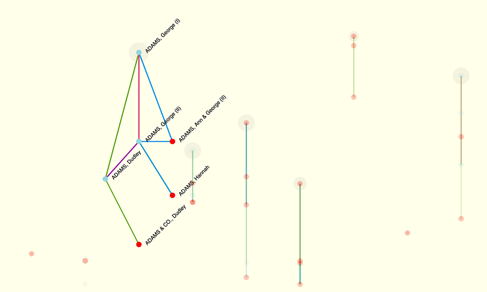
Maker relationships and networks can also be viewed in chronological order. The social groupings, or communities, can be reconfigured into a top-to-bottom timeline view. This gives a clearer picture of how maker communities may have developed over time, either through family, apprenticeship or business associations.
Individual timelines can be expanded to allow a detailed inspection of each social grouping. Details of the names and relationships are shown which more clearly reveals the way in which the maker community developed over time.

Navigation
A date slider allows the data to be filtered to into a date range and allows the user to focus on a specific historical timeframe.
A side navigation bar allows users to seamlessly transition between the different views of the data - giving them the opportunity to inspect the selection from multiple perspectives, before modifying refining or filtering further.

Chronometers
Further work is ongoing to investigate how we may visualise and compare the life cycles of the scientific instruments themselves.
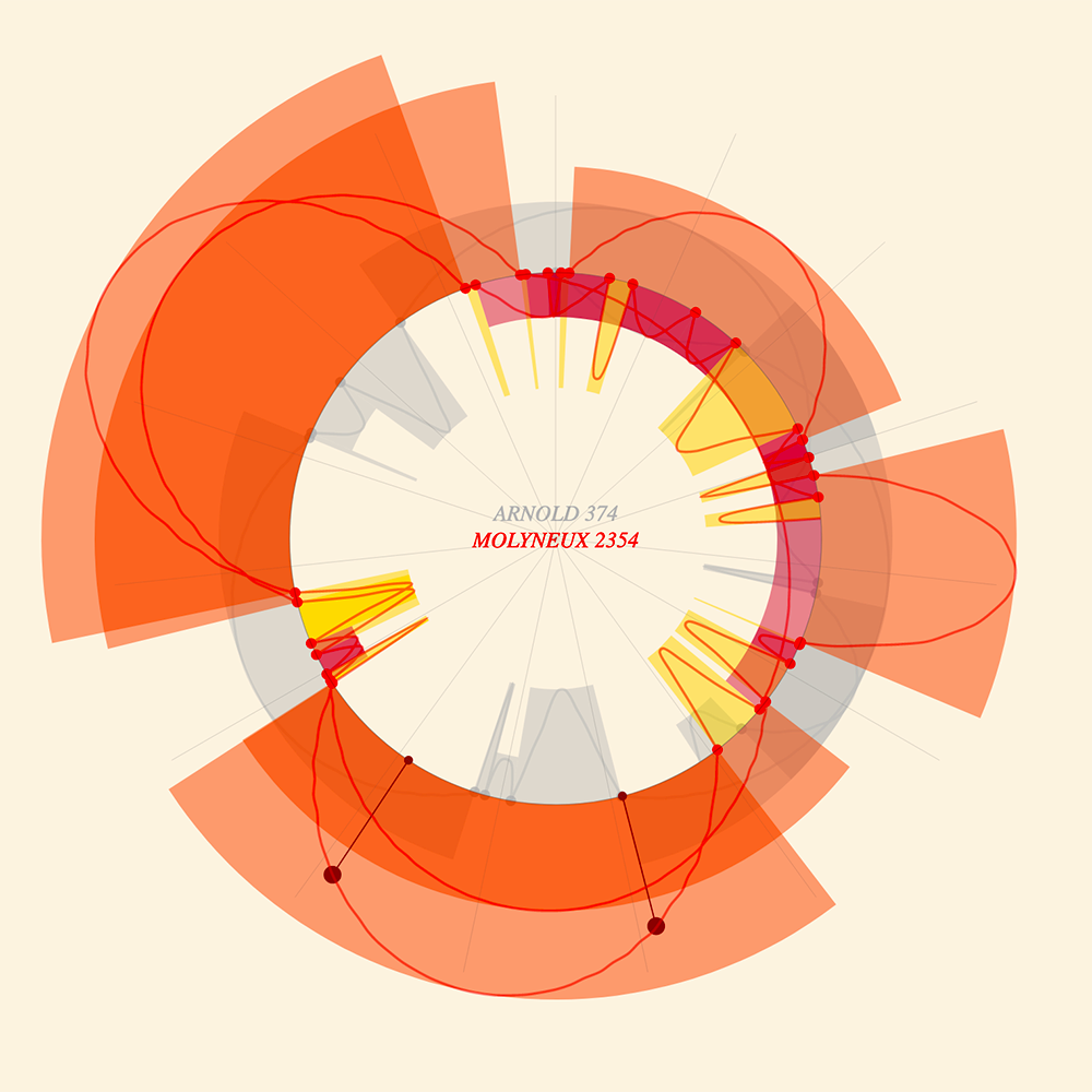
The example here shows data taken from Royal Observatory ledgers of chronometers (naval navigational instruments), charting the dates of their activity: i.e. when they were sent out on a voyage, or returned for testing and repair.
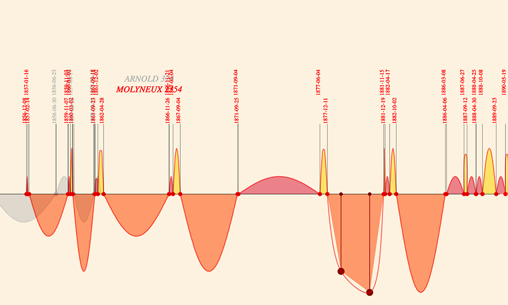
A linear timeline view shows the lifecycle of each object as sequence of curves charting the phases of each period of activity.
A circular view of the visualisation shows the phases of each objects journeys as a repeating cyclical pattern of activity. This view reveals rhythms and repetitions that would not be possible to see from a linear timeline and allows users to overlay see how the patterns of movement compare between objects.
Credits:
Andrew Richardson: Design, Conceptualisation, Data Curation, Data Visualisation
Alex Butterworth: Design, Conceptualisation, Data Curation
Andrew Richardson: Design, Conceptualisation, Data Curation, Data Visualisation
Alex Butterworth: Design, Conceptualisation, Data Curation
